Media language
The music magazine include pop star on the cover. The model is staring directly to the camera which create direct mode address. The quote being use, showing that he excited to participate with Rob stringer + Jeffrey Azoff on their superstar "unicorn". The model look fashionable, he wearing blazer to look standout and attract more audiences. Name written in bright colour and its written in italic to make he look such a fun person. His facial expression doesn't look very serious. The background use is very contrast with the outfit.
Representation
The magazine chose famous pop star to include on the cover which is "Harry Styles" to attract the consumer easily because he known as pop icon.
Audience
The magazine is focus on an audiences who interest in pop music. Target audiences are for teenager to adult and people around that age is listen to a pop song.
Industry
The magazine produce by music week and it has the own website so people can access it digitally.
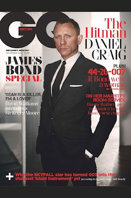
The movie magazine include movie actor on the cover. The model is staring directly to the camera which create direct mode address. Background is look a bit blurry and contrast with the outfit he wear. The lighting is not bright. Majority of colour they use are black to give mysterious effect and red to draw attention to the audiences. His facial expression look serious.
Representation
The camera use medium shot to make the model look elegant.
Audience
The audiences target mostly British people because the model is an english actor and the "British" word is written on G with red colour.
Industry
The magazine produce by GQ magazine
Masthead (paper title) - Use contrast colour (white colour) to look catchy and its capitalised.
Main image - The lady is looking at the camera and it create direct mode address with the target audience, it can make the people to read the front cover of the magazine.
Main cover line - the word “Tropical Fashion” it matches with the main image. It has the leaves to look like in tropical area and the lady wearing necklace to look fashionable.
Cover line - the number 10 is written bigger and rest of the texts use italic written in italic to look catchy, it makes the audience want to look the inside of the magazine and the contents.
Strapline - The magazine want to show the best fashion that they have and its suitable in summer season for the audience to wear due to word "Top Picks".


No comments:
Post a Comment